


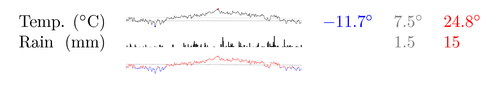
This is my first sparklines experiment. The graphics show daily rainfall and average temperatures in Oslo during the year 2005. A total of 730 data points fitted in an area less then 3.2 square cm! The length of the x axis is only 3.6 cm. I've also included a version of the temperature sparkline where I've used colors to distinguish between above and below zero temperatures. Visually it is a bit difficult to read, but it's implementation is a nice example of path clipping.
PGF/TikZ is well suited for creating sparklines for print. Plotting data at arbitrary scales is straightforward, and control of line widths and alignment is precise.
To run this example you'll need the following data files:
Edit and compile if you like:
\documentclass{article}

\usepackage[latin1]{inputenc}
\usepackage{tikz}


\begin{document}

\def\temperaturedata{data/temperaturesOslo.txt}
\def\raindata{data/rainOslo.txt}

\tikzstyle{maxmark} = [mark=*,mark options={color=red,scale=15}]
\tikzstyle{minmark} = [mark=*,mark options={color=blue,scale=15}]

\pagestyle{empty}

\begin{tabular}{lllll}
    Temp. (${}^\circ$C) &%
    %
    %
    \begin{tikzpicture}[xscale=0.01, yscale=0.01]
        % Draw the zero line
        \draw[ultra thin, black!50] (1,0)--(365,0);
        % Draw average temperature
        \draw[ultra thin, black!20] (1,7.5)--(365,5.5);
        % Plot temperature data and mark the maximum temperature
        \draw[ultra thin] plot[smooth,maxmark, mark indices={192} ]
            file {\temperaturedata};
        % Draw the minimum temperature mark.
        \draw[ultra thin] plot[smooth,only marks, minmark, mark indices={61}]
            file {\temperaturedata};
    \end{tikzpicture}
    %
    %
    & $\textcolor{blue}{-11.7^\circ}$ &
    $\textcolor{black!50}{7.5^\circ}$ &
    $\textcolor{red}{24.8^\circ}$\\
    Rain \hfill(mm) &%
    %
    % Draw rainfall data
    \begin{tikzpicture}[xscale=0.01, yscale=0.01]
        \begin{scope}[ycomb, yscale=0.6]
            \draw[black, thin] plot[] file {\raindata};
        \end{scope}
    \end{tikzpicture}
    %
    &  & $\textcolor{black!50}{1.5}$ & $\textcolor{red}{15}$\\
    &
    %
    % In this plot I use color coding to distinguish temperatures below
    % and above zero degrees. The plot is drawn twice and clipped to
    % achieve the desired effect. Visually the above plot is probably
    % better.
    \begin{tikzpicture}[xscale=0.01, yscale=0.01]
        \draw[ultra thin, black!50] (1,7.5)--(365,5.5);
        \begin{scope}
            \clip (1,0) rectangle (365, 30);
            \draw[ultra thin,red] plot[smooth] file {\temperaturedata};
        \end{scope}
        \begin{scope}
        \clip (1,0) rectangle (365,-11.8);
        \draw[ultra thin, blue] plot[smooth] file {\temperaturedata};
        \end{scope}
    \end{tikzpicture}
    %
\end{tabular}

\end{document}
Click to download: temperature-and-rain-sparklines.tex • temperature-and-rain-sparklines.pdf
Open in Overleaf: temperature-and-rain-sparklines.tex