


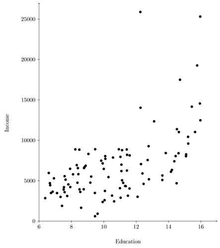
A scatterplot of the relationship between education and income. The plotted data is from the car R package by John Fox. Note that the data is released under the GPL 2 licence.
Edit and compile if you like:
% Author:  Ista Zahn
\documentclass{article}
\usepackage{tikz}


\begin{document}

\begin{tikzpicture}[only marks, y=.5cm]
    \draw plot[mark=*,xshift=-6cm] file {data/ScatterPlotExampleData.data};
    \draw[->,xshift=-6cm] (6,0) -- coordinate (x axis mid) (17,0);
    \draw[->,xshift=-6cm] (6,0) -- coordinate (y axis mid)(6,27);
    \foreach \x in {6,8,10,12,14,16}
        \draw [xshift=-6cm](\x cm,1pt) -- (\x cm,-3pt)
            node[anchor=north] {$\x$};
    \foreach \y/\ytext in {0/0,2.5/5000,5/10000,7.5/15000,10/20000,12.5/25000}
        \draw (1pt,\y cm) -- (-3pt,\y cm) node[anchor=east] {$\ytext$};
    \node[below=1cm] at (x axis mid) {Education};
    \node[left=2cm,rotate=90] at (y axis mid) {Income};
\end{tikzpicture}

\end{document}
Click to download: scatterplot.tex • scatterplot.pdf
Open in Overleaf: scatterplot.tex