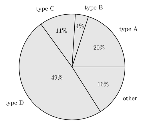
This example shows how to draw a basic pie chart. Note that labels are automatically aligned and placed in a smart way. This makes the code more complicated. However, charts can now bee drawn without worrying about overlapping labels.
Author: | Robert Vollmert |
---|
Do you have a question regarding this example, TikZ or LaTeX in general? Just ask in the
LaTeX Forum.
Oder frag auf Deutsch auf TeXwelt.de.
En français: TeXnique.fr.
% Pie chart
% Author: Robert Vollmert
\documentclass{article}
\usepackage{calc}
\usepackage{ifthen}
\usepackage{tikz}
\begin{document}
\newcommand{\slice}[4]{
\pgfmathparse{0.5*#1+0.5*#2}
\let\midangle\pgfmathresult
% slice
\draw[thick,fill=black!10] (0,0) -- (#1:1) arc (#1:#2:1) -- cycle;
% outer label
\node[label=\midangle:#4] at (\midangle:1) {};
% inner label
\pgfmathparse{min((#2-#1-10)/110*(-0.3),0)}
\let\temp\pgfmathresult
\pgfmathparse{max(\temp,-0.5) + 0.8}
\let\innerpos\pgfmathresult
\node at (\midangle:\innerpos) {#3};
}
\begin{tikzpicture}[scale=3]
\newcounter{a}
\newcounter{b}
\foreach \p/\t in {20/type A, 4/type B, 11/type C,
49/type D, 16/other}
{
\setcounter{a}{\value{b}}
\addtocounter{b}{\p}
\slice{\thea/100*360}
{\theb/100*360}
{\p\%}{\t}
}
\end{tikzpicture}
\end{document}
Comments
Updated example so that it is compatible with PGF 2.0.
Hello,
I've tried to download the Pie Chart example but it is impossible. When I used
wget http://media.texample.net/tikz/examples/PDF/pie-chart.pdf
the answer was
ERROR: 403: Forbidden.
The same is with tex file
Regards K.
Looks like there's a broken link on the figure. Otherwise, I've found the site to be fantastic!
Regards, A.R.
Sorry about that. Forgot to set the correct access rights. Fixed now.
It would be fine if it handled non-integer values: currently e.g. 49.5 plus 50.5 equals 100 but the pies are drawn as if they summed up ~ 99, so decimal digits after comma are silently ignored, correct me if I'm wrong
Paco,
You're right. It's because a counter is used in the example to add up slice percentages.
I don't know on the other hand if there is any way to solve this easily.
Hi, the pie chart looks perfect! However, I have one problem, I can't seem to solve. When I input the second chart in file, the slice of the first value is not drawn (i.e. percent and label are there, but the circle line and gray coloring are missing).
thanks,
Anna, this is caused by the reuse of the counters which have to be reinitialized. I have wrapped up Vollmert's great example into a single macro call along with providing for color specification and auto scaling of input values (they need not be percents). I'll upload that soon. -john
Hey.
Any chance to get this in 3D?? Thanks
Thank you for the coding.... I've tried and it really work.... Thank God!!!!!!!!!!!!!!
Adding comments is currently not enabled.